

Split Screen and Scroll Effects: Editorial Storytelling on Shopify
Most Shopify stores look the same because most Shopify themes give you the same building blocks. A hero, a product grid, a few text blocks. That is fine for a functional store, but it does not tell a story, and some products need a story. A considered fragrance, a piece of design furniture, a founder led brand with a real point of view. For these, the flat, blocky layout that works for a commodity store actively undersells the product. This is where split screen layouts and scroll driven effects come in. Used well, they turn a page from a catalog into a piece of editorial that pulls the reader through a narrative.
This post is about that kind of design. What split screen and scroll effects do, when they genuinely help, when they get in the way, and how to add them to Shopify without a custom build.
What editorial storytelling means for a store
Editorial design borrows from magazines and well made print. Instead of stacking identical blocks, it composes a page, pairing images and text with intention, giving elements room to breathe, and guiding the reader's eye through a sequence. The reader does not just scan a grid. They move through a story.
For the right product, this matters because the buying decision is emotional as much as practical. Someone buying a luxury candle or a designer chair is not comparing spec sheets. They are deciding whether the brand feels right, whether the product fits the life they imagine. A page designed as a story can carry that feeling in a way a product grid never will. It signals care, and care signals quality.
Two techniques do most of the heavy lifting here. Split screen layouts and scroll driven effects.
Split screen layouts
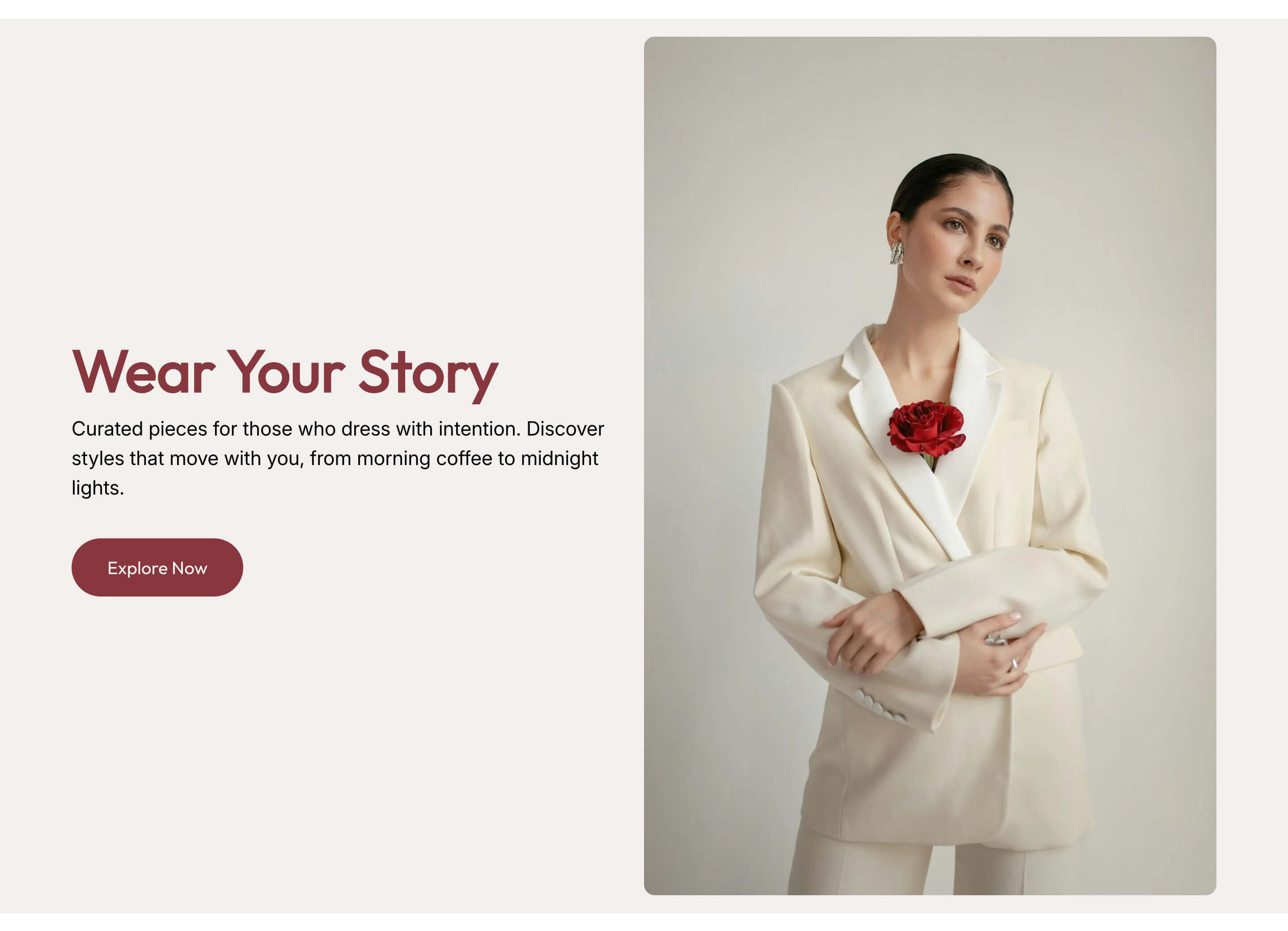
A split screen layout divides the screen, typically into two halves, with one side carrying an image and the other carrying text. It is a simple idea with a strong effect. The image gets room to be bold, and the text sits beside it with space and focus, instead of being crammed above or below.
Split layouts work well for a few reasons. They create a clear visual balance between what you are showing and what you are saying. They feel modern and considered, closer to a well designed magazine spread than a template. And they let you pace a page, alternating which side the image sits on as the reader scrolls, so each section feels distinct rather than repetitive.
A split screen section is a strong choice for a brand story, a product's key features presented one at a time, or a founder's message. Anywhere you want a single idea to land with weight, the split layout gives it the space to do so.
Scroll driven effects
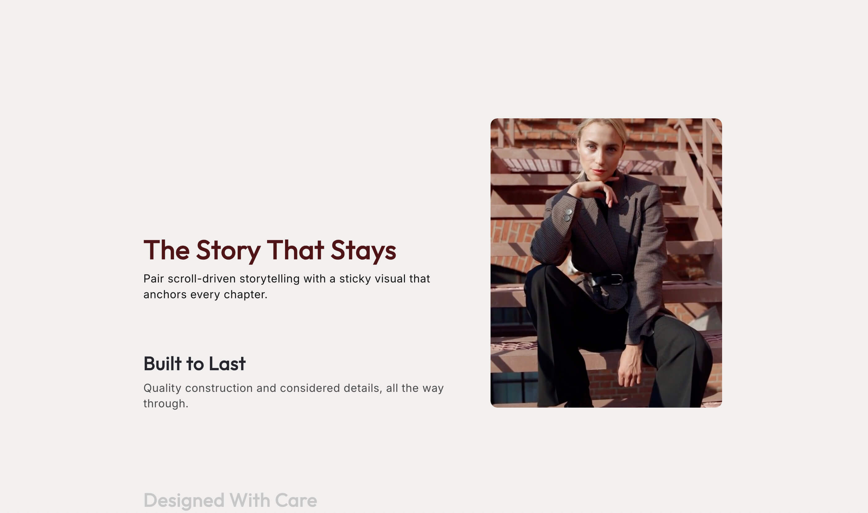
Scroll effects use the act of scrolling itself as part of the experience. As the reader moves down the page, elements can reveal, shift, or stay fixed while other content moves past them. Done with restraint, this makes a page feel alive and guides attention exactly where you want it.
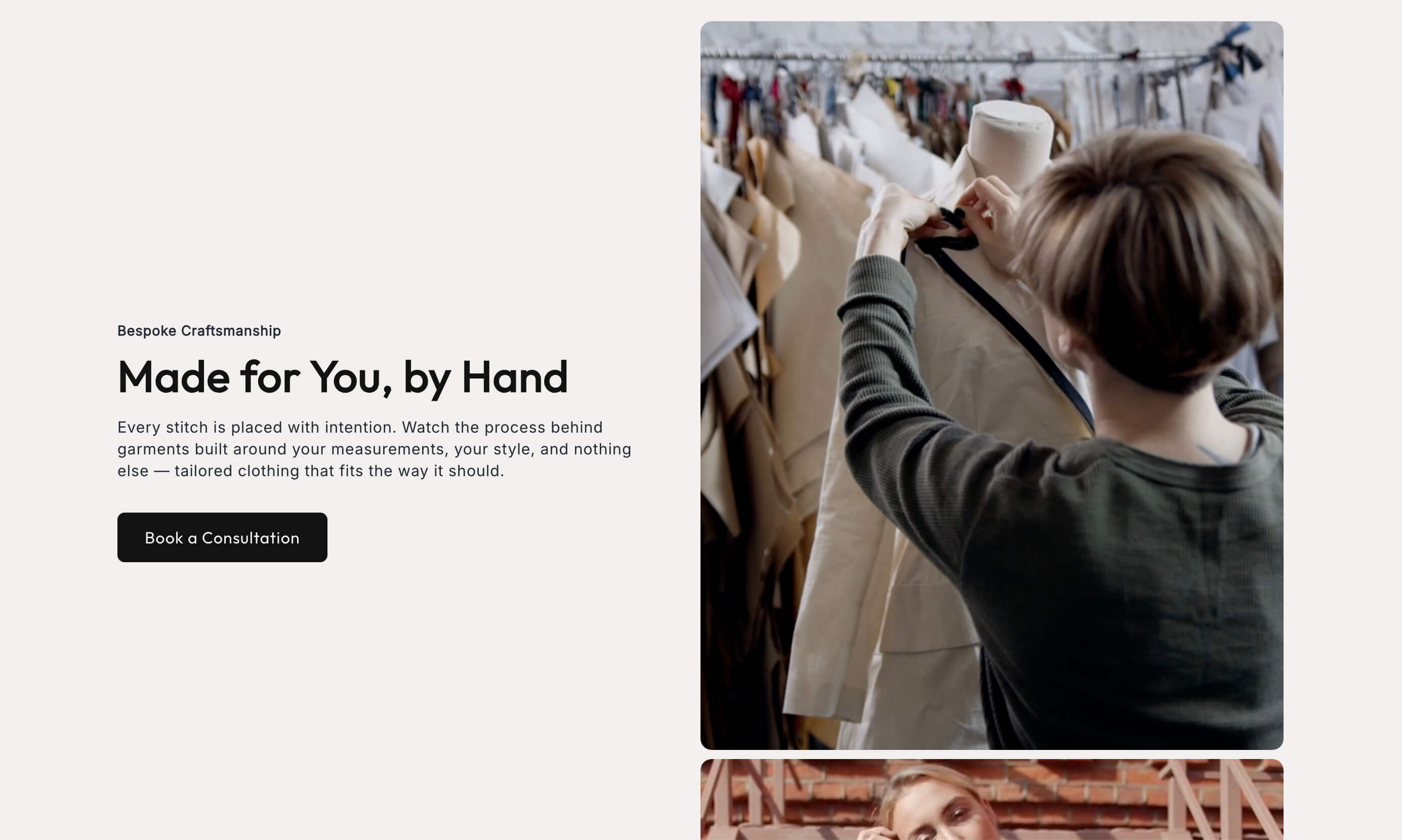
One of the most useful patterns is the sticky or vertical scroll effect, where a piece of media stays in place while text scrolls alongside it, or where content transitions as the reader progresses. A split screen vertical scroll section can hold an image steady on one side while a sequence of points scrolls past on the other, which is a clean way to walk a reader through several features or steps without breaking the flow. A sticky media section achieves a similar effect, anchoring a visual while the story unfolds around it.
The appeal is control over pace. A normal page dumps everything at once and lets the reader skim. A scroll driven page reveals ideas in sequence, so the reader takes them in one at a time, in the order you intended. For a narrative product page, that control is exactly what you want.
When these effects help, and when they hurt
Here is the honest part, because these techniques are easy to overuse.
They help when the product benefits from emotion, story, or a premium feel. Considered purchases, brand led products, high touch categories, and anything where the decision is partly about how the brand makes the shopper feel. In those cases, editorial design lifts the perceived value and sets you apart from the identical looking competition.
They hurt when they get in the way of buying. If a shopper knows exactly what they want and just needs to purchase it quickly, a heavily animated, slowly revealing page is friction, not delight. A commodity product bought on price and speed does not need a scroll story. It needs a fast, clear path to checkout. Do not put editorial flourish between a ready buyer and the buy button.
They also hurt when they are overdone. A page where everything animates, slides, and reveals is exhausting, not impressive. The effects should serve the story and then get out of the way. If a reader notices the animation more than the product, the design has failed. Restraint is what separates editorial from gimmicky.
And they hurt when they are heavy. Scroll effects and large images can slow a page and, if built carelessly, feel janky on lower end phones. A story page that stutters as it scrolls undercuts the premium feeling it was meant to create. Keep the media optimized and test on a real mid range phone, not just your own device.
A simple test before you use them
Before adding these effects, ask one question. Does this product's buyer want to feel something, or do they just want to buy quickly. If the answer is feel something, editorial storytelling is worth it. If the answer is buy quickly, keep the page fast and simple and put your effort into clarity instead.
Many stores have both kinds of pages. A homepage or a hero product page might justify a rich, story driven treatment, while the rest of the catalog stays lean and functional. There is no rule that every page must match. Use the story treatment where it earns its keep and keep the workhorse pages efficient.
How to add them to Shopify
Split screen and scroll effects have traditionally meant custom development, which is why so few stores have them. Building these layouts and animations by hand takes a developer, and maintaining them through theme updates takes more developer time. That cost is why most stores default to the flat, blocky look.
Native sections change that math. Sections like split screen, split screen vertical scroll, and sticky media install into your theme and are edited in the standard theme editor, so you get editorial layouts and scroll effects without commissioning custom code. You add the section, drop in your images and text, and adjust the settings, the same way you would with any other part of your theme.
Start with one page that deserves the treatment, usually your homepage or your most important product. Build the story there, test it on desktop and mobile, and see how it performs before rolling the approach out further. One well made story page teaches you more than a dozen half considered ones.
The takeaway
Split screen layouts and scroll driven effects are how you move a Shopify store beyond the identical, blocky look that most themes produce. For products that sell on emotion, story, and a premium feel, they turn a page into an experience and lift the perceived value of the brand. For fast, functional purchases, they are unnecessary friction, so use them where they fit and keep the rest lean.
If you have a product that deserves to be told as a story rather than listed in a grid, these sections give you an editorial look without a custom build. Explore the Abra split screen and scroll sections, or try a few from the Shopify App Store.
Frequently asked questions
Do scroll animations hurt SEO or page speed? They can if built carelessly with heavy media, which slows the page and can hurt Core Web Vitals. Well built native sections with optimized images keep the effect light. Always test a story page on a mid range phone, not just your own device.
When should I not use editorial or scroll effects? When the shopper just wants to buy quickly. For commodity products bought on price and speed, animation is friction, not delight. Save the story treatment for products that sell on emotion or a premium feel, and keep the fast movers lean.
Do split screen and scroll effects work on mobile? They should, but only if built for it. A split layout typically stacks on smaller screens, and scroll effects need to stay smooth on a phone. Test on a real device to make sure the experience is not janky before you rely on it.