
Announcement Bars and Marquees: Small Sections With Outsized Impact
Some of the most valuable real estate on a store is also the smallest. The thin strip at the very top of the page, and the scrolling band of text or logos that catches the eye as a visitor arrives. These are announcement bars and marquees, and store owners often treat them as afterthoughts. That is a mistake. Because they sit at the top of every page and move, they are among the first things a visitor sees, which means they shape the first impression before the hero even loads. Used well, they carry your most important message to every single visitor. Used badly, they annoy people or waste the spot on nothing.
This post covers what these small sections do, how to use them without irritating shoppers, and how to get them onto your Shopify store.
What an announcement bar is for
An announcement bar is a thin strip, usually across the very top of the page, carrying a single short message. Free shipping over a threshold. A current promotion. A shipping cutoff before a holiday. A new launch. Because it appears on every page and sits above everything else, it is the most reliable way to get one message in front of every visitor no matter where they land.
The strength of the announcement bar is its reach and persistence. A message in your footer is seen by almost no one. A message in the announcement bar is seen by everyone. That is why it should carry your single most important, most time relevant message, and nothing less.
The discipline it requires is restraint. You have room for one clear message, so choose the one that matters most right now. When stores try to cram three offers into the bar or rotate through five messages too fast, the value collapses. The visitor cannot read a bar that changes every second, and a cluttered bar communicates nothing. One message, stated plainly, does the work.
What a marquee adds
A marquee is a band of content that scrolls horizontally across the screen. It might scroll text, like a repeating message or a set of short value propositions, or it might scroll images and logos, like press mentions, brand partners, or product shots. The motion is the point. Movement draws the eye in a way a static block does not, so a marquee is good at getting attention for something you want noticed.
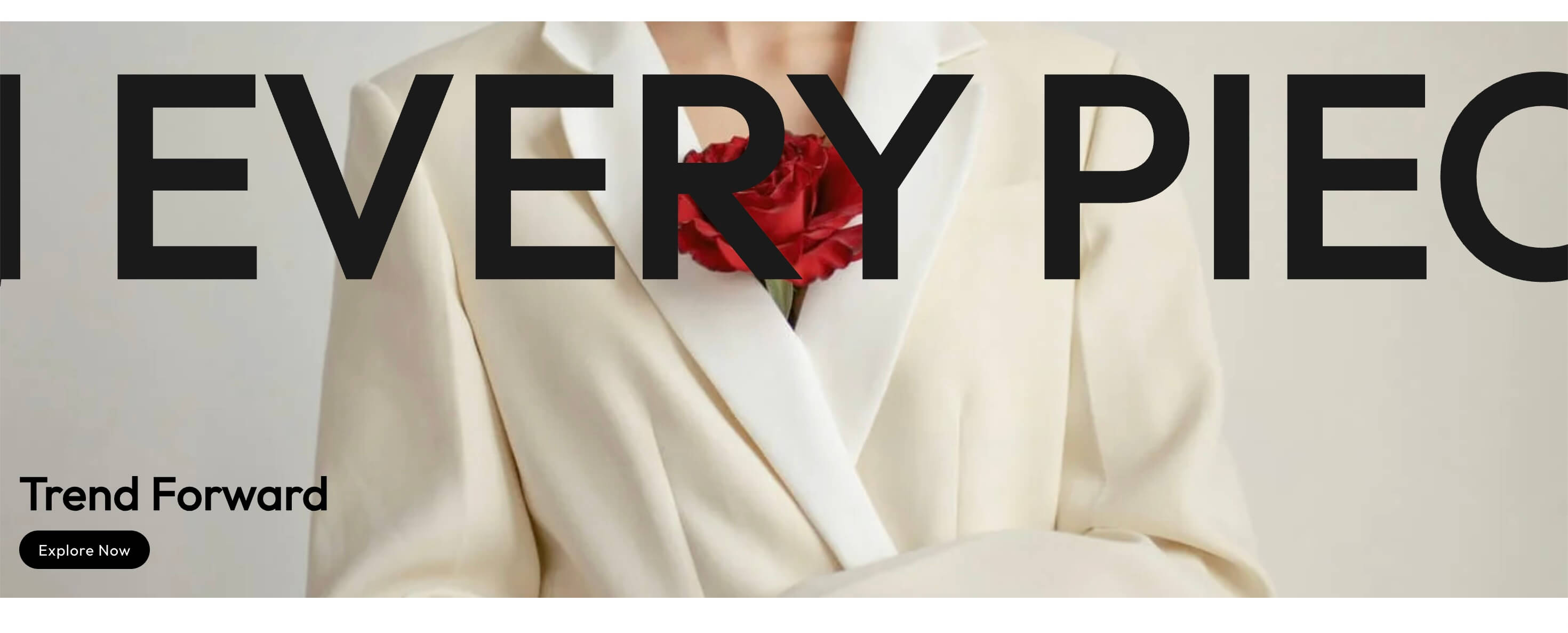

Marquees serve a few clear purposes. A marquee hero can make a bold, moving statement at the top of a page, giving your brand an energetic, modern feel right away. A marquee of images is a clean way to show a row of press logos, partner brands, or awards, letting them scroll rather than cramming them into a static strip. A scrolling text marquee can carry a short set of reasons to buy, like free shipping, easy returns, and a guarantee, moving them past the visitor in a way that gets noticed.
The same warning applies as with the announcement bar. Motion attracts attention, which is exactly why overusing it backfires. A page with several things scrolling at once feels chaotic and cheap. A single, well placed marquee reads as intentional and stylish. More than that reads as a distraction.
Using them without annoying shoppers
These sections sit in prime attention space, so getting the details right is what separates useful from irritating.
Keep the message short and readable. In an announcement bar, that means a single sentence a visitor can absorb at a glance. If it is too long to read while skimming, it is too long. In a scrolling marquee, keep the scroll speed slow enough that a person can actually read it. A marquee that whips past too fast is decoration nobody can parse.
Do not overload the visitor with movement. One moving element on a page is engaging. Several are overwhelming. If you use a marquee, let the rest of the page above the fold be calm so the motion stands out rather than competing with three other animated things.
Make the offer actionable when it makes sense. If the announcement bar promotes a sale, linking it to the sale collection turns a passive message into a path. A visitor who reads "30% off this weekend" should be able to tap the bar and land on the deals. Do not make them go hunting for what you just advertised.
Consider letting shoppers dismiss a persistent bar. Some visitors want the message gone after they have seen it, and a small close option respects that without hiding the message from everyone else. This is a small courtesy that keeps a persistent element from feeling naggy on repeat visits.
Keep it light. These are small sections, so they should stay small in weight too. A marquee stuffed with large unoptimized images can slow the top of your page, which is the worst place to be slow. Compress anything visual and keep the section lean.
Where each one fits
A little thought about placement makes these sections work harder.
The announcement bar belongs at the very top of every page, carrying your single most important current message. Update it as your priorities change, from a shipping promotion to a launch to a seasonal cutoff, so it always reflects what matters most right now. Treat it as a live piece of the store, not something you set once and forget.
A marquee hero fits at the top of a page where you want an immediate, energetic impression, often the homepage. It sets a tone before the visitor scrolls.
An image or logo marquee fits a bit further down, wherever social proof or partnerships belong, giving those logos motion and prominence without a bulky static grid.
A scrolling text marquee of value propositions works well just below the hero, reinforcing the reasons to buy right as the visitor starts to engage.
Getting them onto your Shopify store
Many themes include a basic announcement bar, though it is often limited to a single static message with little styling control. Marquees are rarer in default themes, and building one by hand usually means custom code. That gap is why a lot of stores either skip these sections or settle for the plain built in version.

Native sections give you more control without adding an app to your storefront. An announcement bar section lets you style and link the message the way you want, while marquee sections give you scrolling text and image bands that install into your theme and are edited in the standard theme editor. Because they are native, they do not carry the overhead of a separate app just to display a strip at the top of your page.
The takeaway
Announcement bars and marquees are small in size and large in influence, because they occupy the first attention a visitor gives your store. An announcement bar carries your single most important message to every visitor on every page. A marquee uses motion to draw the eye to something you want noticed. Both reward restraint. One clear message, one tasteful moving element, kept short, readable, and light. Get that balance right and these tiny sections punch far above their size.
If your announcement bar is doing nothing useful, or you have never tried a marquee, these are quick, high visibility improvements to make. Explore the Abra announcement and marquee sections, or try a few from the Shopify App Store.
Frequently asked questions
What should my announcement bar say? Your single most important, most time relevant message, stated in one clear sentence. Free shipping over a threshold, a current sale, or a shipping cutoff. Resist cramming in multiple offers, since one message a visitor can read at a glance does far more work.
Can shoppers close the announcement bar? It is worth allowing on a persistent bar. Some visitors want the message gone after seeing it, and a small dismiss option keeps the bar from feeling naggy on repeat visits without hiding it from first time visitors.
Do marquees slow down my store? Only if they carry heavy media. A text marquee is very light. An image or logo marquee should use compressed visuals, since anything heavy at the top of the page is the worst place to be slow. Keep it lean and it stays fast.