

Designing Shopify Sections That Do Not Fall Apart on Mobile
Here is how most Shopify pages get built. Someone opens the theme editor on a laptop, arranges a beautiful two column layout, checks the little phone preview once, decides it looks fine, and publishes.
Then the majority of their traffic arrives on a phone and sees something else entirely. Text that shrank to nothing. A hero where the headline sits over the busiest part of the photo. A two column layout that stacked in the wrong order so the image comes before the point. A buy button four scrolls down.
Mobile is not the smaller version of your site. For most stores it is the site, and the desktop layout is the variation.
Why the phone preview lies
The preview panel in the theme editor is a rectangle on a big screen. It shows you proportions. It does not show you the things that actually cause problems.
It does not show you the phone browser's address bar eating vertical space. It does not show you how a real thumb reaches. It does not show you what your page feels like on a slow connection outdoors. It does not show you the moment where a shopper has scrolled past your hero and cannot remember what the product costs.
The preview tells you whether it fits. It does not tell you whether it works.
The failures that show up again and again
Text sized for a laptop. Body copy that reads comfortably at arm's length on a 27 inch monitor is small on a phone held at reading distance. Anything under about 16px in body text is a strain, and strained shoppers skim instead of read.

Stacking in the wrong order. A two column section with copy on the left and an image on the right stacks to copy then image, or image then copy, depending on the section. One of those makes sense and one does not, and the difference is whether your pitch arrives before or after the picture. A split screen section should let you control which half leads on mobile rather than guessing.

Heroes that lose their message. A hero cropped for a wide screen often crops badly for a tall one. The subject slides out of frame, the text overlay lands on a busy area, and the headline becomes unreadable. Heroes need a separate mobile image or a focal point setting, not just a resize.
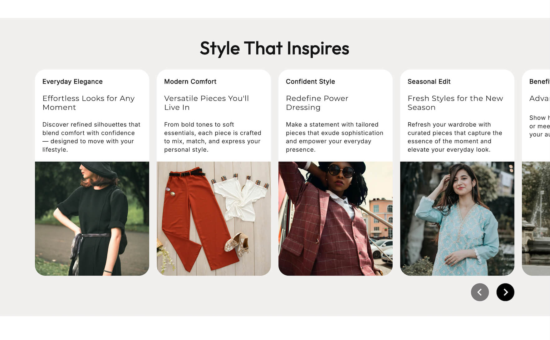
Grids that become confetti. Four columns of cards on desktop become four tiny columns or an endless single file column on mobile. Neither reads well. A cards carousel that swipes horizontally often solves this better than stacking, because it keeps the set feeling like a set.
Tap targets too small or too close. Fingers are not cursors. Anything tappable wants to be roughly 44 by 44 pixels with space around it, and two links a few pixels apart will produce misfires and frustration.
Stacked banners eating the screen. An announcement bar, plus a cookie notice, plus a newsletter popup, plus a sticky header can consume most of a phone screen before any content appears. Each one was added for a good reason. Together they are a wall.
Horizontal scroll. A single element slightly too wide makes the whole page shift sideways, which feels broken even when everything else is perfect. It is usually a table, a wide image, or an element with a fixed pixel width.
Design decisions that fix most of it
Design the mobile version first. Not as a compromise, as the primary. Decide what the section must communicate in a narrow column, then work out what to do with the extra space on desktop. Working in that order means the phone version gets the good decisions instead of the leftovers.

Cut, do not shrink. When space runs out, the instinct is to make everything smaller. Better to remove. If a section has a headline, a subheading, three bullets, a paragraph, and two buttons, the mobile version probably needs the headline, one line, and one button. The rest was desktop luxury.
One clear action per screen. A shopper should never have to choose between two competing buttons in the same glance. Pick the primary action and make the other one secondary or lower down.
Keep the price and the buy button reachable. If a shopper scrolls three screens of lifestyle imagery before finding out what something costs, some of them stop scrolling. Sticky add to cart on product pages exists for this reason and is worth turning on.
Watch vertical budget. Every section costs scroll. A page with nine sections on desktop can be an exhausting page on mobile. Ask of each one whether a phone shopper needs it, and consider dropping two.
Respect the load cost. Mobile shoppers are more often on slower connections. Large hero images, autoplaying video, and heavy apps hurt more here than anywhere else, and the conversion penalty for slow mobile pages is well established.
Test it properly, it takes ten minutes
Open your store on your own phone, on cellular data rather than wifi, and do the whole thing: land on the homepage, click into a collection, open a product, add to cart, start checkout. Do not use the theme preview. Use the real site the way a customer would.
Then try it one handed, which is how most people hold a phone. Can you reach the important buttons with a thumb.
Then hand your phone to someone who does not know the store and ask them to find a specific product and add it to the cart. Watch where they hesitate and do not help them. That five minute exercise finds more problems than an hour of self review.
Also check Shopify analytics for the split between mobile and desktop conversion rate. A gap is normal, since mobile browsing includes more casual traffic. A very large gap is a signal that something on the phone experience is broken rather than just different.
The bottom line
Mobile is where most of your shoppers are, so it deserves the first decision rather than the last check. Design the narrow version first, cut instead of shrinking, control how sections stack, keep tap targets and text large enough, protect the path to the buy button, and test on a real phone on real data.
If your current sections do not give you separate control over the mobile layout, that is a theme limitation rather than a fact of life. The Abra section library is built to be configured per breakpoint, so the phone version can be a deliberate design instead of whatever the desktop layout collapses into.
Frequently asked questions
What percentage of Shopify traffic is mobile? For most consumer stores the majority, often well over half, though it varies by category and traffic source. Check the device breakdown in your own Shopify analytics rather than relying on an average, since a store selling to businesses may see a very different split.
Why is my mobile conversion rate lower than desktop? Some gap is normal, because mobile carries more casual and social traffic. A large gap usually points to something specific: slow load times, a buy button buried below several screens, small tap targets, or a checkout step that is awkward on a phone. Walk the full purchase path on your own phone to find it.
Should I use a separate image for mobile heroes? Yes, wherever the section allows it. A wide desktop crop usually loses its subject on a tall phone screen, and text overlays that sit in clear space on desktop can land on a busy part of the image. A dedicated mobile crop, or at minimum a focal point setting, fixes it.