

Your Collection Pages Are Doing More Selling Than Your Homepage
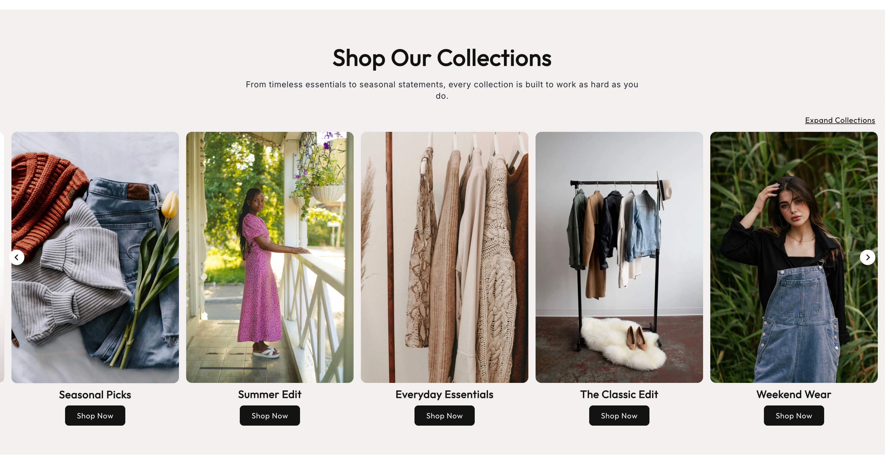
Store owners obsess over the homepage. It gets the custom hero, the brand video, the three rounds of feedback from friends. Meanwhile the collection pages, the ones where people are actually browsing with intent, sit on whatever the theme shipped with.
Check your analytics before you argue. A large share of your traffic never touches the homepage at all. Google sends people straight to a collection page. Ads send people straight to a collection page. Shoppers who arrive on your homepage click into one within seconds. The collection page is where browsing turns into a product choice, and for most stores it is running on defaults.
Why the collection page is the real storefront
Think about what a shopper is doing on that page. They have narrowed to a category. Now they are scanning, comparing, and deciding what is worth a closer look. Every product they open is a decision your collection page made for them.
That means the page has two jobs. It has to help someone who knows what they want find it fast, and it has to help someone who is just looking discover something worth clicking. Those are different needs, and the default grid serves neither particularly well.
The homepage says who you are. The collection page decides what gets bought.
Start with the top of the page
The most neglected space on a Shopify store is the area between the collection title and the first row of products. On most stores it is empty, or it holds one line of theme placeholder text.
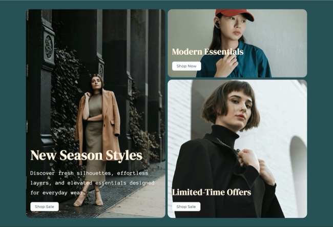
That space is where you set the frame. A short paragraph, two or three sentences, that says what is in this collection and who it is for. Not keyword filler. Real orientation: "Our lightweight jackets, made for spring commutes and unpredictable weather. If you need something for real cold, the insulated range is over here."
This does three things at once. It orients the browser, it gives Google unique text on a page that is otherwise a product grid shared with a hundred other stores, and it gives you a natural place to link to the neighbouring collection.
If the collection is large or the choice is complicated, add a short guide above the grid. Two or three cards pointing to sub groups, "by size", "for beginners", "gifts under fifty", turn a wall of products into a set of paths.
Fix the product card
The product card is the most repeated element on your store and usually the least considered. Small improvements there compound across every collection page you have.
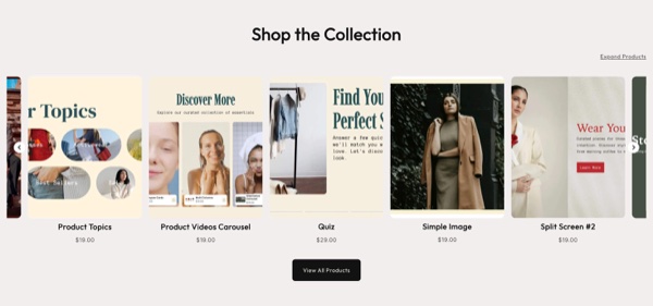
Show a second image on hover or swipe. The alternate angle, or the product on a person, answers the scale question without a click.
Show the variant options that matter. Colour swatches on the card let a shopper skip products in colours they do not want, and jump straight into the one they do.
Show price clearly, including sale price. Hiding price until the product page does not create intrigue, it creates friction.
Say when something is out of stock. Letting a shopper click into a sold out product feels like a bait and switch, and it wastes the click.
Keep the image ratio consistent. Mixed aspect ratios make a grid look chaotic even when the photography is good. This is the single fastest visual upgrade for most stores.
A product listing section with control over these details is worth more than another homepage animation.
Sorting, filtering, and the size of the grid
If a collection has more than about twenty products, filtering stops being a nice extra and becomes the difference between browsing and giving up. Filter by the attributes people actually shop on, which is usually size, colour, price, and one category specific thing like scent, material, or skill level.
Be careful with sort defaults. "Featured" is only useful if someone has actually curated the order. An unmanaged featured order is often just the order products were created in, which puts your oldest, worst selling items at the top of every category. Check what your default order actually shows and set it deliberately.
Keep the first screen dense enough to feel like a selection. A grid showing two products on a phone screen makes a fifty product collection feel empty.
Collections as navigation, not just storage
Collections are not only filing cabinets. They are the most flexible merchandising tool Shopify gives you, and most stores use maybe a third of what they can do.
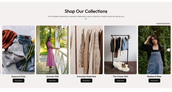
Seasonal collections, gift collections, use case collections, price band collections. Each one is a page you can send traffic to, rank for, and link internally.
Surface them properly. A collection list section on the homepage or inside a parent collection turns your categories into an actual browse path instead of something buried in a dropdown. Featured collections let you pull a specific handful of products from a collection onto another page, which is how you cross sell without a plugin.
Cross link between related collections in that intro paragraph. It helps shoppers, and it spreads internal link equity to pages that often have very little.
The SEO piece most stores skip
Collection pages are frequently the strongest ranking opportunity in an ecommerce catalog, because a search for "linen shirts" is a category query, not a product query. Google wants to return a category page.
Three things matter most.
Write a unique title tag and meta description per collection, not the theme default. "Linen Shirts | Brand" plus a real one line description beats an untouched template.
Add that unique intro copy discussed above. A page with nothing but a product grid is thin, and thin pages get quietly dropped from the index.
Handle pagination and filtered URLs deliberately, so you are not generating hundreds of near identical pages competing with each other.
None of this is glamorous. All of it moves traffic.
The bottom line
The collection page is where most of your shoppers actually decide, and on most stores it is the least designed page in the catalog. Add real intro copy, fix the product card, make filtering work past twenty products, set your sort order on purpose, and treat collections as merchandising tools rather than folders.
If your theme's collection layout is limiting what you can do, the Abra section library includes collection lists, product listings, and card grids that install into your existing theme and let you build the browse experience your catalog actually needs.
Frequently asked questions
Should collection pages have text on them? Yes. Two or three sentences above the grid explaining what is in the collection and who it is for. It orients shoppers, gives you a natural place to link to related collections, and adds the unique text that keeps an otherwise thin product grid indexed.
How many products should show before pagination? Enough that the collection feels substantial, usually twenty four to forty eight, with infinite scroll or a load more button rather than a numbered page trail if your theme supports it. Very long single pages hurt load time, so balance density against speed and test on mobile.
What is the best default sort order for a collection? Whatever you have actually curated. The "featured" default in many themes reflects creation order, which often puts your oldest products first. Either curate the manual order deliberately or set the default to best selling, then check what a shopper sees on the first screen.