

Comparison Tables and Pricing Tables: The Sections That Close the Sale
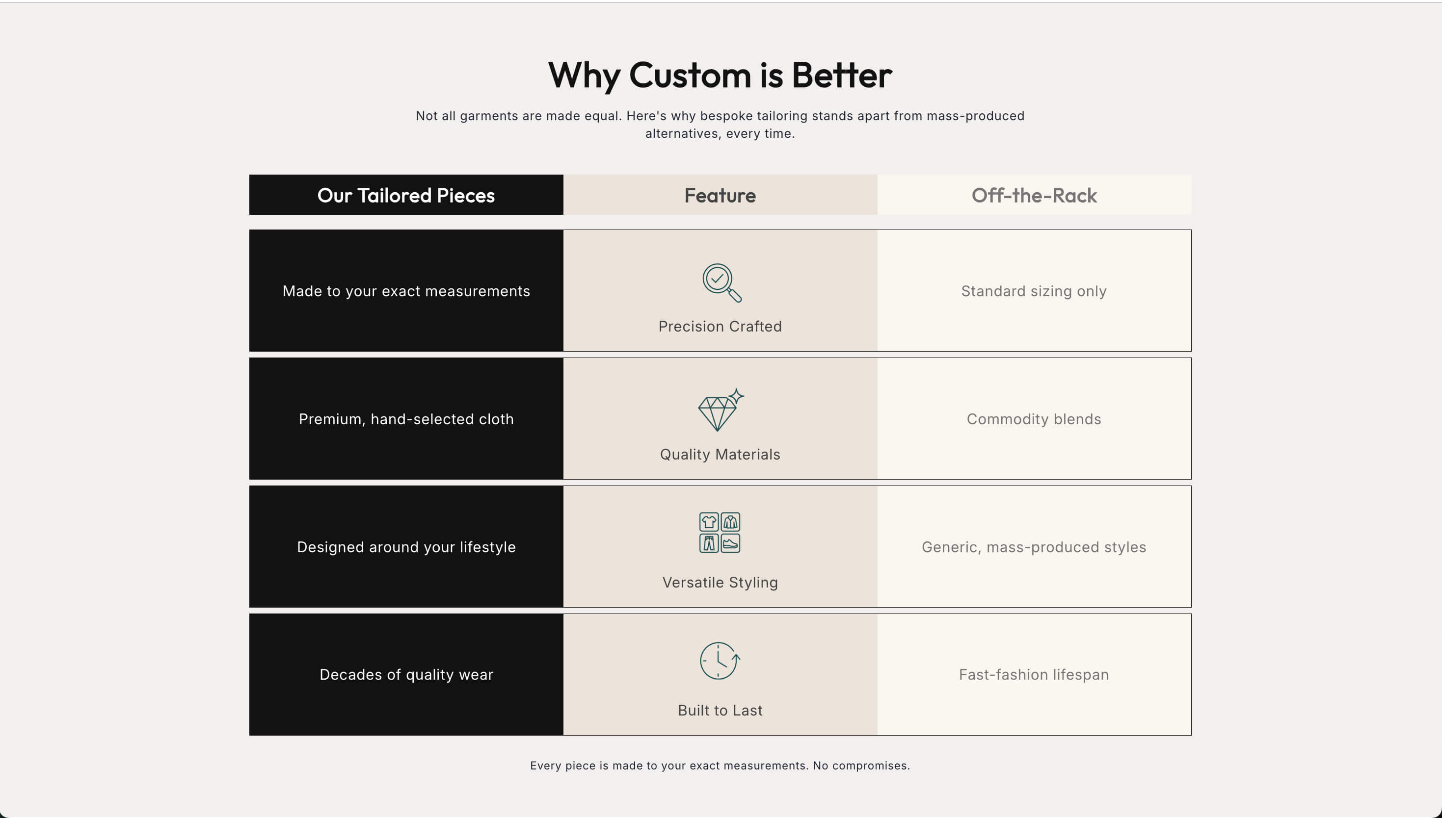
There is a specific moment where sales quietly die. The shopper likes your brand, trusts the product, and is now flipping between two tabs of your own catalog trying to work out whether they want the standard or the pro, the 250ml or the 500ml, the starter kit or the full set. They cannot decide, so they decide later, which usually means never.
A comparison table is the section that ends that loop. It is not glamorous and nobody puts it in the case study, but it converts, because it does the one thing the shopper is stuck on: it makes the difference obvious.
Why the stuck shopper is your best opportunity
Someone comparing two of your products has already done the hard part. They are past "do I trust this store" and "do I want this kind of thing". They are on the last question, which is "which one".
That shopper is cheap to convert and expensive to lose. You do not need better ads or a bigger discount. You need to answer one question clearly, and you can do it with a table.
It also protects your average order value in both directions. A clear comparison stops people defaulting to the cheapest option out of confusion, and it stops people buying the expensive one, feeling oversold, and returning it.
What belongs in the table
The single biggest mistake is listing everything. A table with eighteen rows is not a comparison, it is a spreadsheet, and the shopper will bounce off it the way they bounce off any spreadsheet.
Include only the attributes that differ and that a buyer actually weighs. Four to seven rows is usually right. If a feature is identical across every option, it does not belong in the comparison, it belongs in the product description.
Write the rows in customer language, not spec language. "Lasts about two weeks of daily use" beats "500mAh battery". "Fits a 15 inch laptop" beats "38cm interior width". The shopper is not evaluating specs, they are picturing their own life.
Be honest about the tradeoff. A table where the expensive option wins every row is not a comparison, it is an upsell, and shoppers read it as one. Real differences run both ways: the smaller one is lighter and cheaper, the bigger one lasts longer and costs more. Say that. Trust converts better than persuasion.
Guide the choice, do not just present it
A neutral table leaves the shopper doing the work. A guided table makes the recommendation for them.
Add a "best for" row at the top of each column. Best for first timers. Best for daily use. Best for gifting. That one line does more than the rest of the table combined, because most people are not comparing features, they are trying to identify themselves.
Highlight one option as the common choice. Marking the middle tier as most popular is not manipulation if it is true, it is useful information, and it gives the undecided shopper a default.
Put a buy button in every column. A comparison table that ends without a way to act sends the shopper back to navigate, and every extra step loses people. The compare section is built for exactly this shape, with each option carrying its own call to action.
Where to put it
On a product page, place the comparison below the main product information, once the shopper knows what they are looking at. Comparing before you have sold the category is premature.
On a collection page for a small family of products, a table near the top can act as the chooser for the whole range and stop people opening five tabs.
On a dedicated landing page for a product line, the comparison is often the centerpiece and can sit right under the hero.
Do not put a comparison table in the footer or on a separate "compare" page nobody visits. It has to appear in the flow of the decision.
When a pricing table is the right tool instead
Comparison tables and pricing tables look similar and do different jobs.
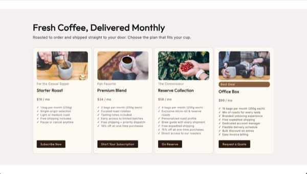
A comparison table is for physical variants and models where the differences are attributes. A pricing table is for tiers where the difference is what is included: service packages, subscription levels, bundles, memberships, or a studio's project rates.

The pricing table conventions exist because they work. Three tiers, not six. A clear price at the top of each. A short list of what is included, with the differences visible. One tier visually emphasized. A single action per column.
If you sell services alongside products, or run a subscription, this is the section that does the explaining. If you sell three sizes of the same candle, use a comparison instead.
There is also a middle case. Sometimes the shopper is not choosing between products, they just need to understand what one product includes. That is a job for a product features section, which lays out benefits without forcing a comparison that does not exist.
Make it work on a phone
This is where most comparison tables fail. A four column table that looks sharp on a desktop becomes an unreadable horizontal scroll on a phone, and most of your traffic is on a phone.
The fix is to stop thinking of it as a table on small screens. Stack the options as cards, one per screen, each with its own "best for" line, its short list of differences, its price, and its button. The shopper swipes or scrolls through options instead of squinting at a grid.
Test it on an actual phone before you ship it. Load the page, try to read a row, try to tap a button. If you have to zoom, it is not done.
Keep it accurate
A comparison table is a promise. If it says the pro model ships free and it does not, you have created a support ticket and lost a customer's trust in one row.
Every time you change a price, a spec, or what is in a bundle, the table changes with it. Put it on the same checklist as your product data, because a stale table is worse than no table.
The bottom line
The shopper stuck between two of your products is one clear answer away from buying. A short, honest comparison table with a "best for" line, real tradeoffs, and a button in every column gives them that answer at the moment they need it. Use a pricing table when the difference is what is included, and make sure both work on a phone.
The Abra compare and pricing table sections install directly into your theme, take your own styling, and give each option its own call to action so the decision ends in a purchase rather than another tab.
Frequently asked questions
How many products should a comparison table include? Two to four. Beyond four columns the table stops being scannable and starts being homework, and on mobile it falls apart entirely. If you have a larger range, group it and compare within the group rather than showing everything at once.
What is the difference between a comparison table and a pricing table? A comparison table compares products or variants on attributes like size, materials, or capacity. A pricing table compares tiers on what is included, which suits services, subscriptions, bundles, and memberships. Use whichever matches the actual decision the shopper is making.
Should the most expensive option always be the recommended one? No. A table where the top tier wins every row reads as an upsell and shoppers discount it. Show real tradeoffs in both directions and recommend the option that fits most buyers, which is usually the middle one. Honest recommendations produce fewer returns and more repeat customers.