

What Makes a High Converting Shopify Hero Section

The hero section is the first thing almost every visitor sees when they land on your store. It is the top of your homepage, the part that fills the screen before anyone scrolls. You get a few seconds here to answer the only questions a new visitor is really asking. What is this. Is it for me. What do I do next. Get those answers right and the visitor keeps going. Get them wrong and they leave, and no clever product page later can save a visitor who already bounced.
This post breaks down what actually goes into a hero section that converts, the common mistakes that quietly cost sales, and how to build a strong one on Shopify.
The job of a hero section
It helps to be clear about what the hero is for, because a lot of stores treat it as decoration. It is not decoration. It is the most valuable piece of real estate on your entire site, and it has one job. Orient the visitor and move them toward the next step.
A visitor arrives with no context. They may have clicked an ad, followed a link, or found you in search. Whatever brought them, they know almost nothing about you yet. The hero has to close that gap fast. It should make the visitor understand what you sell and why it matters to them, and it should make the path forward obvious. Everything else in a good hero serves that goal.
The parts of a high converting hero
A strong hero is not complicated. It is a few elements doing their jobs well.
A clear, benefit led headline
The headline is the single most important element, and it is where most stores fumble. A weak headline describes the company. A strong headline describes what the visitor gets. "Welcome to our store" tells the visitor nothing. "Skincare that actually clears breakouts" tells them exactly whether they are in the right place.
Lead with the benefit or the outcome, not your brand name or a vague slogan. The visitor does not care about your mission statement in the first three seconds. They care whether you solve their problem. Say that plainly.
A supporting subheadline
The subheadline is where you add the detail the headline could not carry. If the headline states the main benefit, the subheadline can name who it is for, how it works, or what makes it different. Keep it to a sentence. Its job is to sharpen the promise, not to explain everything.
One clear call to action
Every hero needs a primary action, and ideally just one. "Shop the collection." "Find your shade." "Start here." The button should be easy to see, easy to understand, and easy to tap on a phone. When you offer a visitor five equal choices, you often get no choice at all, because deciding is work and confused visitors leave. Give them one obvious next step.
If you truly need a secondary action, make it visually quieter than the primary one so there is no ambiguity about the main path.
Visuals that support the message
The imagery should reinforce the headline, not fight it. A hero image or video should show the product in use, the result it delivers, or the world your brand lives in. It should never be a generic stock photo that could belong to any store. If your visual and your words are telling two different stories, the hero gets weaker, not stronger.
The mistakes that cost sales
Knowing what to include is half of it. The other half is avoiding the traps that make heroes underperform.
The biggest one is being vague. A hero that could belong to any store in your category tells the visitor nothing specific and gives them no reason to stay. Specificity is what makes a hero convincing. Name the benefit, name the customer, name the difference.
The second is burying the point below the fold. If a visitor has to scroll to understand what you sell or to find the button, you have already lost some of them. The core message and the primary action should be visible without scrolling, on both desktop and mobile.
The third is a slow, heavy hero. Because the hero loads first, a giant unoptimized image or an autoplaying high resolution video can wreck your load time and your Core Web Vitals right at the moment of first impression. A hero that looks stunning but takes four seconds to appear is a hero most visitors never see. Compress your images, and if you use video, keep it light and consider a static fallback.
The fourth is too much going on. Some heroes try to say everything at once, with multiple headlines, several buttons, and a busy background competing for attention. Clutter defeats the purpose. A hero works by being clear, and clarity comes from restraint.
Static, slider, or video
There is no single right format for a hero. The best one depends on what you are selling and what you need to communicate.
A static hero is a single image or design with your headline and button. It is the fastest to load and the easiest to keep focused. For many stores it is the strongest choice precisely because it forces a single clear message.

A hero slider rotates through several slides. It is useful when you genuinely have multiple things to feature, such as a few distinct collections or campaigns. Use it with care, since sliders that auto rotate too fast give visitors no time to read, and every extra slide is extra weight. A hero slider works best when each slide has its own clear message and call to action, and when the rotation is slow enough to read.
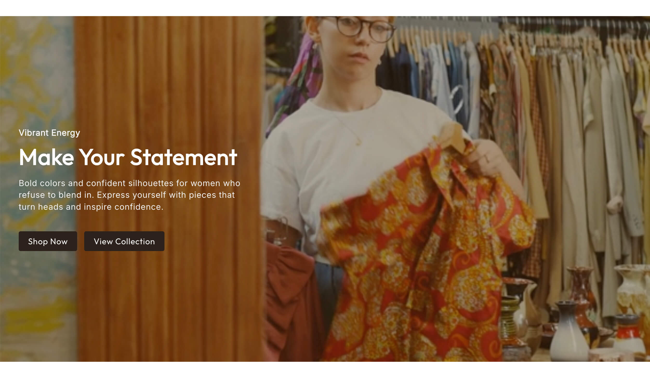
A video hero uses motion to set a mood or show the product in action. Motion grabs attention, and for the right brand a hero video can be powerful. The tradeoff is weight, so keep the file small, mute it by default, and make sure it does not delay the headline from appearing.
A split layout is worth considering when you want text on one side and a strong image on the other. A split screen hero gives the headline room to breathe while keeping a bold visual in view, which reads as modern and editorial without getting cluttered.
How to build a strong hero on Shopify
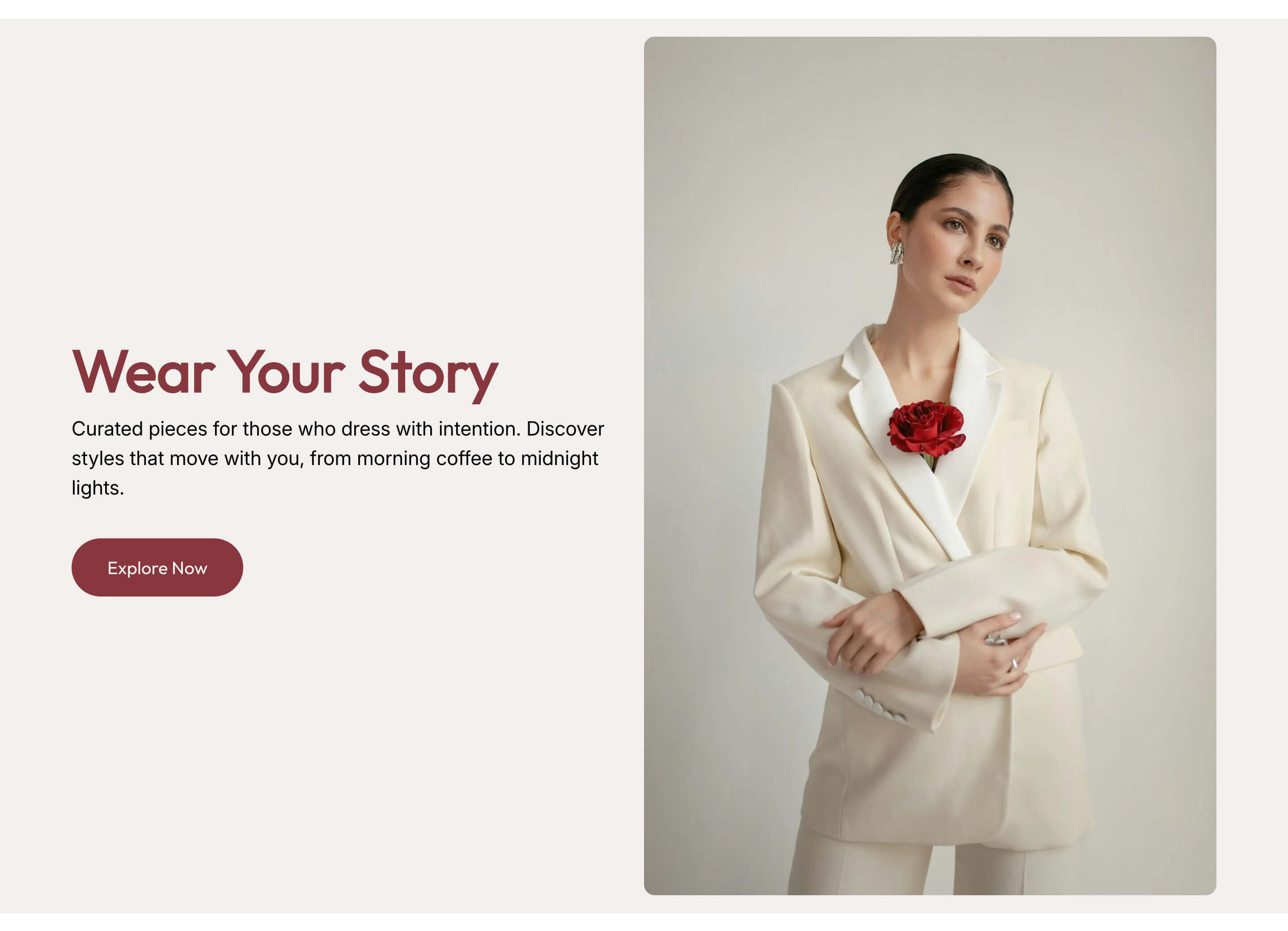
Most themes ship with a basic hero, and for some stores it is enough. The limits show up when you want a specific layout the theme does not offer, or a slider or video hero the theme handles poorly, or simply a more refined design than the default.
You can push the theme's built in hero as far as it goes, hire a developer for something custom, or add a native hero section that installs into your theme and is edited in the standard theme editor. The native route keeps you in one workflow and avoids the overhead of a separate app. The Abra library includes several hero options, from the hero slider to the hero video to the split screen layout, so you can match the format to your message rather than forcing your message into whatever the theme allows.
Whatever you build, test it. Watch your homepage bounce rate and the click rate on the hero button. If visitors are arriving and leaving without engaging, the hero is usually the first thing to fix. Try a sharper headline, a clearer button, or a lighter visual, and measure the change.
The takeaway
A high converting hero section is not about looking impressive. It is about being clear, fast, and focused. Say what you sell and why it matters, give one obvious next step, support it with a visual that fits, and keep it light enough to load instantly. Do that and the hero does its real job, which is turning a cold visitor into someone who wants to see more.
If your current hero is vague, slow, or cluttered, it is the highest leverage thing on your site to improve. Explore the Abra hero sections that install directly into your theme, or start with a few free options on the Shopify App Store.
Frequently asked questions
How tall should a Shopify hero section be? Tall enough to make an impression, short enough that your core message and primary button are visible without scrolling on both desktop and mobile. If a visitor has to scroll to understand what you sell or to find the button, the hero is too tall or too vague.
Should I use a hero slider or a single image? Use a single image when you have one clear message, since it removes any ambiguity about what to click and loads fastest. Use a slider only when you genuinely have multiple things to feature, and keep the rotation slow enough to read.
Does a video hero hurt page speed? It can, because the hero loads first. If you use video, keep the file small, mute it by default, and make sure it does not delay the headline from appearing. A static fallback image helps on slower connections.