

Before and After Sliders on Shopify: The Section That Sells Results
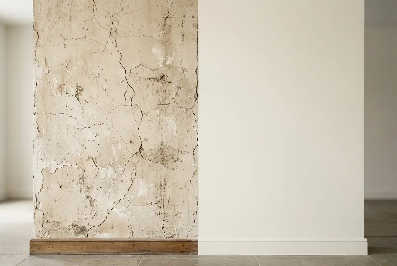
Some products are hard to sell with a photo of the product alone. A jar of serum, a cleaning solution, a set of teeth whitening strips, a paint color. The product itself is not the point. The result it delivers is the point, and a static product shot does a poor job of showing a result. This is exactly the gap a before and after slider fills, and for the right kind of store it is one of the most persuasive sections you can add.
If you sell a transformation, this post is for you. Here is why the format works, which businesses get the most out of it, how to use it honestly, and how to add one to your Shopify store.
Why a before and after slider converts
A before and after slider is an interactive image with a handle the visitor drags left and right. On one side is the starting state. On the other is the result. The shopper controls the reveal, and that small act of dragging does something a plain photo cannot.
First, it shows proof instead of claiming it. Anyone can write "visibly smoother skin in four weeks." A slider lets the shopper see the change and judge it for themselves. Seeing is more convincing than reading, and it sidesteps the natural skepticism people bring to marketing copy.
Second, it makes the visitor an active participant. Dragging the handle is a tiny interaction, but interaction holds attention. A shopper who is dragging a slider is engaged with your product in a way a passive scroller is not, and engaged shoppers are closer to buying.
Third, it answers the real question the shopper is asking. They do not care what your product looks like on a shelf. They care what it will do for them. A before and after visual speaks directly to that question, which is why it belongs near the buying decision, not buried at the bottom of the page.
Which stores need this most
A before and after slider is not for every store. It shines when your product creates a visible change. Here is where it tends to earn its place.
Skincare and beauty brands are the obvious fit. Acne treatments, anti aging serums, brightening products, self tanner, makeup. The change is visible, and buyers are deeply skeptical of marketing claims, so real visual proof carries weight.
Health, fitness, and wellness businesses can show body composition changes, posture correction, or results from a program, as long as the claims are honest and appropriately disclaimed.
Home and cleaning products are a natural match. Stain removers, restoration products, polishes, and paint all deliver a dramatic visible difference that a slider captures better than words.

Home improvement and renovation, whether products or services, can show a room, a floor, or a piece of furniture before and after. The contrast does the selling.
Dental and cosmetic products like whitening kits show a clear, comparable change that shoppers immediately understand.
If your product does not produce a visible transformation, this is not your section, and that is fine. Reach for social proof formats like testimonials instead. Forcing a before and after where there is no real visual change reads as filler.
The honesty rule you cannot skip
A before and after slider lives or dies on trust, so this part is not optional. The images have to be real and representative.
Do not use dramatically different lighting, angles, or filters between the two states to fake a bigger change. Shoppers and regulators both notice. In many product categories, especially health and beauty, misleading before and after imagery can cross into false advertising, so keep results typical and disclose when individual results vary.
The stronger long term play is honesty anyway. A believable, moderate transformation converts better than an unbelievable dramatic one, because shoppers trust what looks real and dismiss what looks staged. If your best real result is modest, show the modest result. Credibility sells more over time than exaggeration.
Where you can, use the same customer, the same conditions, and the same framing for both images. Consistency is what makes the comparison fair and the proof convincing.
Where to place it on your store
Placement decides how much work the section does.
On product pages, put the slider close to the product description and the add to cart area. This is where the shopper is weighing the decision, and visual proof at that moment directly supports the sale.
On your homepage, a single strong before and after can serve as social proof for your whole brand, especially if you sell a hero product that most customers buy first.
On a dedicated results or landing page, a series of sliders across different customers or use cases builds a body of evidence. Variety helps here, since a shopper wants to see the result on someone who resembles their own situation.
Pair the slider with a short, real customer quote whenever you can. The image shows the change, the quote adds the human voice, and together they are stronger than either alone. Your testimonials section can sit right below the slider to reinforce it.
How to add a before and after slider to Shopify
Most Shopify themes do not include a before and after slider by default, so you have a few options.
You could commission custom code, which works but costs more and adds a maintenance burden every time your theme updates. You could install a single purpose app, which adds another subscription and another script loading on your storefront. Or you can use a native section that installs into your theme and is edited in the standard theme editor.

The Abra before and after section takes the third path. You add it to a page, upload your two images, adjust the settings, and it renders as part of your theme with no separate app running in the background. Because it is native, it does not carry the performance overhead of a standalone app, which matters since heavy images are already the main weight in this kind of section.
A few practical tips once it is installed. Use high quality images that are the same size and aspect ratio, so the comparison is clean. Compress them properly before uploading, because two large photos in one section can slow the page if you are careless. And test the drag handle on mobile, since most of your visitors will experience the slider with a thumb, not a mouse.
Getting the most out of it
Once your slider is live, treat it like any other conversion element and pay attention to it. If you have the traffic, test the page with and without the slider and watch your conversion rate and add to cart rate. Refresh the images as you gather better real results. And resist the urge to overload the page with five sliders when one strong, honest comparison will do more.
The format is simple, but it maps perfectly onto how people actually buy transformation products. They want to see it work before they trust it with their money. A before and after slider lets them do exactly that.
If your product delivers a visible result, this is one of the highest leverage sections you can add. Try the Abra before and after section, or browse the full library on the Shopify App Store to see how it fits alongside the rest of your store.
Frequently asked questions
What products work best with a before and after slider? Anything that creates a visible change. Skincare and beauty, health and fitness, cleaning and restoration products, home improvement, and teeth whitening are strong fits. If your product does not produce a visible transformation, use testimonials or other proof instead.
Are before and after images a legal risk? They can be if they mislead. Using different lighting, angles, or filters to fake a bigger change can cross into false advertising, especially in health and beauty. Keep the two images consistent, show typical results, and disclose that individual results vary.
Does a before and after slider slow my store? Only if the images are heavy. The slider itself is light, but two large uncompressed photos add weight. Compress both images and match their dimensions before uploading, and test the drag handle on mobile since most visitors will use a thumb.